Yesterday, Arteta’s table-topping Arsenal were in the news again.
But this time, not for secretly hiring pickpockets to rob his players (cringe, I know, right?). Arsenal hired an expert to help the team get better at one of the most neglected aspects of football: Throw-ins.
Why? To get an extra edge in tight games. This got me thinking of how it applies to content writing.
When writing, we usually focus more on the spotlight stuff—optimizing for SEO—that we pay little attention to one small detail that matters:
Optimizing for readability.
I know, you’ve probably heard LinkedIn content specialists repeat that to you a thousand times. “Use short paragraphs to keep readers engaged,” they say. “Add a lot of subheadings for scannability. And don’t forget to use bullet points and simple words.”
The truth? That’s the tip of the iceberg. Optimizing for readability goes beyond that.
Below, I reveal some pro readability hacks that’ll help you write content that hooks readers from start to finish, improving comprehension, SEO, and ultimately, conversions.
But before I begin, why is doing SEO alone not enough?
Key Takeaways
- People don’t read. They skim
- Quality content balances SEO with readability
- SEO gets readers in; readability is what makes them stay
- Traffic means nothing if readers leave after 30 seconds.
- Think beyond ranking. Create articles people enjoy reading.
- There is more to readability than using short paragraphs and sentences.
- Optimizing for readability improves engagement, comprehension, and conversions.
Why SEO Alone Isn’t Enough Anymore
SEO drives organic visitors to your website. But it doesn’t make them stay and engage with your content. That’s where readability comes in.
Unfortunately, only 2 in 10 websites have optimized readability. Research shows that 60% of readers abandon a page if they find the text too complex.
What does this mean for you?
How do People Read Online?
A blog ranking on the first page should be enjoyable to read, right? That was exactly what I thought when I clicked on an article ranking top for a keyword I searched.
Turns out, I was completely wrong! The blog structure was an eyesore—like a front yard overrun with giant dandelion weeds. I developed a headache scanning through the huge walls of text, which seemed to be everywhere.
It would appear the author doesn’t know how people read online. I’ll give you some insights:
1. People don’t read; they scan
A report by The Times reveals that 55% of online users spend less than 15 seconds on a page. This is proof that people don’t read web pages word for word as we assume. Instead, they scan using the F and Z pattern.
- Using fewer words
- Including lists and bullet points
- Prioritizing short paragraphs and sentences
- Highlighting important words or phrases
- Breaking up text with descriptive subheadings
- Adding visuals (images, charts, etc.)
2. They follow F and Z patterns to find key information
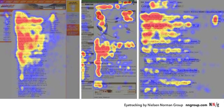
Eye-tracking research by the Nielsen Norman Group (a leading usability and UX research company) discovered that users scan content using the F pattern.
First, they scan the content horizontally across the first line. Then horizontally across the second line, but shorter. Finally, they scan vertically along the left side, in search of headings or keywords that may interest them.
In a LinkedIn post, a Senior Semrush Content writer, Carlos Silva, shed light on the F-shaped reading pattern. He further provided tips on how to optimize your content for the pattern.
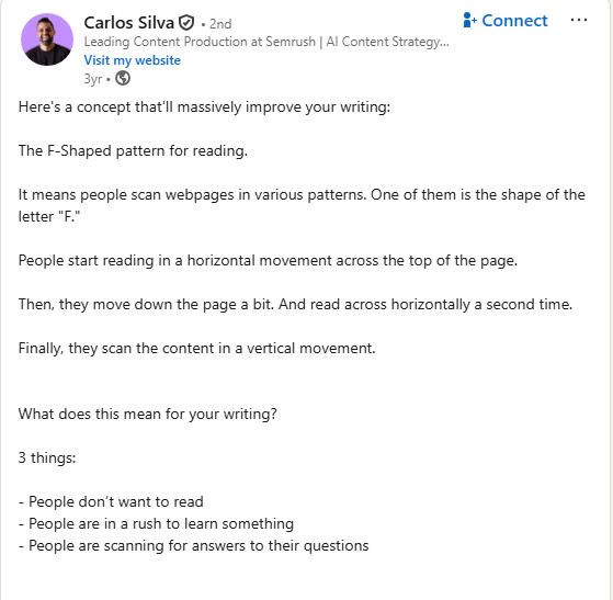
The F-shaped pattern is common in text-heavy webpages like blogs and news sites. People scan using this pattern because they are in a hurry.
Rather than read a 1,500-word web content—which requires cognitive effort and focus—they’d rather skim and extract important information fast.
They only slow down and read when something catches their attention. Here is an eye-tracking heat map that shows the F-shaped scanning pattern.
People also scan using the Z-shaped pattern. This is common among visitors of pages with dense texts and visuals, such as landing pages, sales pages, and other conversion assets. The Z-shaped pattern involves users scanning a page in a Z manner.
Here’s how it works: First, their eyes move from the top left corner to the top right. Then they move diagonally to the bottom left and end at the bottom right, forming the Z shape.
Below is an example of what the Z-shaped pattern looks like
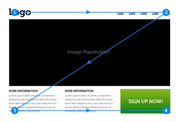
Here is how to structure your content for the Z-shaped reading pattern:
- Ensure the text is skimmable.
- Highlight important information along the Z path.
- Place Important information at the top-left corner.
- Use a clear and engaging headline across the top.
- Place final calls to action at the bottom right.
- Guide the eyes diagonally with visuals (images, charts, etc)
Adapting your webpages to these scanning patterns will result in lower bounce rates, less cognitive overload, and better engagement and scrolling. What’s more, people will understand your message faster, leading to higher conversion rates.
3. Readers can only process so much information at once
I once stumbled on a blog post with an interesting topic that piqued my interest. Excited, I clicked the link, ready to feast on the content.
But there was a problem.
The blog post had huge walls of text, the kind that could make your brain and eyes ache. There were also long and dense paragraphs that made scanning a nightmare.
So I took a glance at the long blocks of text, got frustrated, and exited the site. This is exactly what happens when you overwhelm readers with too much information.
Humans have short attention spans; hence, they can only process a limited amount of information at a time. It’s why popular brands like Semrush present information in smaller sections, using visuals to break up text.
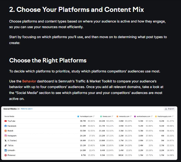
Long and dense paragraphs, zero hierarchy, no white spaces, and walls of texts increases readers cognitive overload. This forces them to skim or stop reading altogether.
Here is how to make readers interested in reading your content:
- Break information into smaller bits. Better to slice a meal than swallow it whole, right?
Use clear headings and subheadings. It helps break up your content and guide readers’ eyes.
Use short paragraphs. They make content easier to scan. 2-3 sentences per paragraph is ideal
Add white spaces. It reduces cognitive load and helps readers scan your content better.
Highlight important ideas. It helps readers spot important information without reading the entire content.
Remove fluff. It helps improve flow and readability.
4. Readers look for cues
When a reader lands on your blog post, what happens? First, they scan. While scanning, their eyes are naturally drawn to visual cues like:
- Numbers
- Bolded words
- Bullet points
- Words in different colors
- Words in capital letters
- Words in quotation marks
- Words above, below, or beside any of these elements
These cues act as anchors that help readers scan your content efficiently. Huei-Hsin Wang and Megan Chan put it perfectly:
“On the web, users are often looking for specific information. For this reason, they do not read every word on the page. Instead, they scan: they fixate their attention on summaries, bullet points, visuals, and bolded text, aiming to locate what they are looking for quickly.”
Readers are drawn to visual cues because the brain is naturally attracted to stimuli when scanning dense information. Adding visual cues can help guide readers’ eyes, improving the readability and flow of your content.
What Most People Get Wrong About Readability
I Googled the keyword “How to make your content readable” and checked the articles on the first page.
Guess what?
About 90% of them mentioned the usual regurgitated basics: Use short paragraphs. Add enough subheadings and bullets. Write simple sentences. Make it easy to scan….
The truth? They all work. But with human attention span shrinking fast, you need more than the basics to ensure that readers understand and engage with your content.
You need to pay attention to details such as:
- Sentence
- Line length
- Typography
- Visual hierarchy
- Grammar and flow
- Length of bullet points
- White spaces (margins, content width, spaces between paragraphs, etc.)
You also need to understand how people read online, what attracts their eye while on your page, and, of course, what puts them off.
Here is what I’m talking about:
6 Pro Readability Hacks Most Writers Ignore
1. Front Load Important Information
The content of your first paragraph will determine if website visitors stay or bail. Want them to stay? Include the good stuff in the first line of each paragraph or section. They’ll bail if you bury it further down your content.
Why? Because people are lazy. They want to find relevant information fast, without investing much mental effort reading every word ( honestly, it can be mentally exhausting).
This is evident in eye-tracking studies, which indicate that people typically read only about 20–28% of the words on a page. In addition, research shows that readership drops with each paragraph.
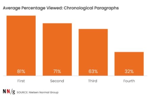
Including the main point at the beginning of a paragraph or section is like putting the fillings at the front of a sandwich instead of burying it under three bites of plain bread.
It makes it easier for people to grasp the key message quickly, even if they read the first few sentences. It also helps them decide if they want to read the rest of the paragraph or not.
Here is an example from Semrush.
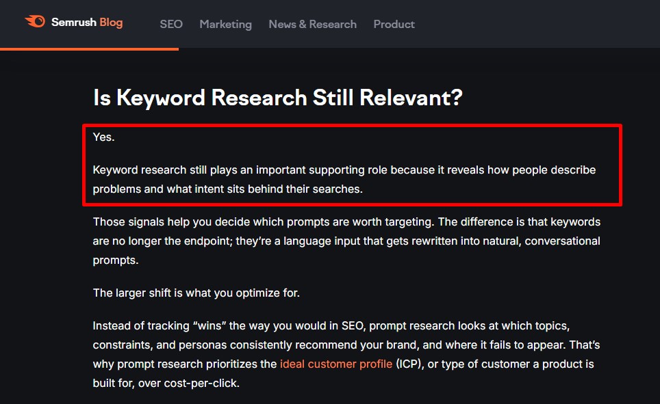
If you notice, the key message of the heading “Is keyword research still relevant”? was included in the first two sentences, then supporting details followed. This helps readers quickly grasp the main idea without reading further down the page.
Here is another example, still from Semrush.
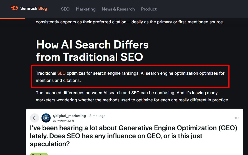
See how the main point was placed in the first sentence? Readers don’t have to spend time on that section to understand the main point.
2. Include one idea per paragraph
Including two or more ideas in a paragraph is like serving soup, steak, and chocolate cake in one bowl.
Eeeew!
They look unappetizing together. But place them in different bowls, and everyone wants a bite—or maybe two.
When you focus on one idea per paragraph, you make it easy for readers to understand your point, argument, or narrative. Mix multiple ideas together in one paragraph, and you might confuse or overwhelm the reader.
Here is an example from CrazyEgg, a web analytics tool.
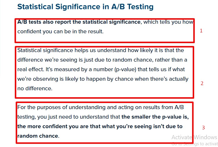
In the above example, each paragraph has one clear idea. The first paragraph was used to introduce statistical significance.
The second explains what it means and how it’s measured. At the same time, the third paragraph focused on how to interpret statistical significance in practice.
Aside from making your point clear to readers, introducing one idea per paragraph also makes your content skimmable. And as you know, skim reading is the new normal. According to surveys by HubSpot, around 43% of people say they skim blog posts rather than read them thoroughly.
To make your content skimmable, aim for 2-4 sentences per paragraph, with each paragraph starting with the main point.
3. Break grammar rules for clarity
Want people to enjoy your content? Break grammar rules unapologetically. Yes, it may sound counterintuitive. But sticking rigidly to them makes your writing stiff and lifeless. Like an academic paper.
See what I did there?
I broke a grammar rule by using a sentence fragment (an incomplete sentence). And you probably didn’t notice. Because doing so made the sentence clearer, more human, and impactful. Not the opposite.
After all, the goal of writing is to communicate clearly. So why stick to some old rules that don’t help you achieve that?
Even Ann Handley, Author of Everybody Writes, is a big fan of breaking grammar rules. She says:
“I encourage you to safely and fearlessly break those rules and to make those mistakes in writing — but only when doing so lends greater clarity and readability.”
Hoa Loranger, VP at Nielsen Norman Group, also supports breaking grammar rules. However, she’s against breaking them ignorantly or with abandon. Here’s what she has to say:
“You must first know the rules before you can break them effectively.” She went further to add that “The rules that you can violate depend on the context, the target audience, and the brand or tone of voice.”
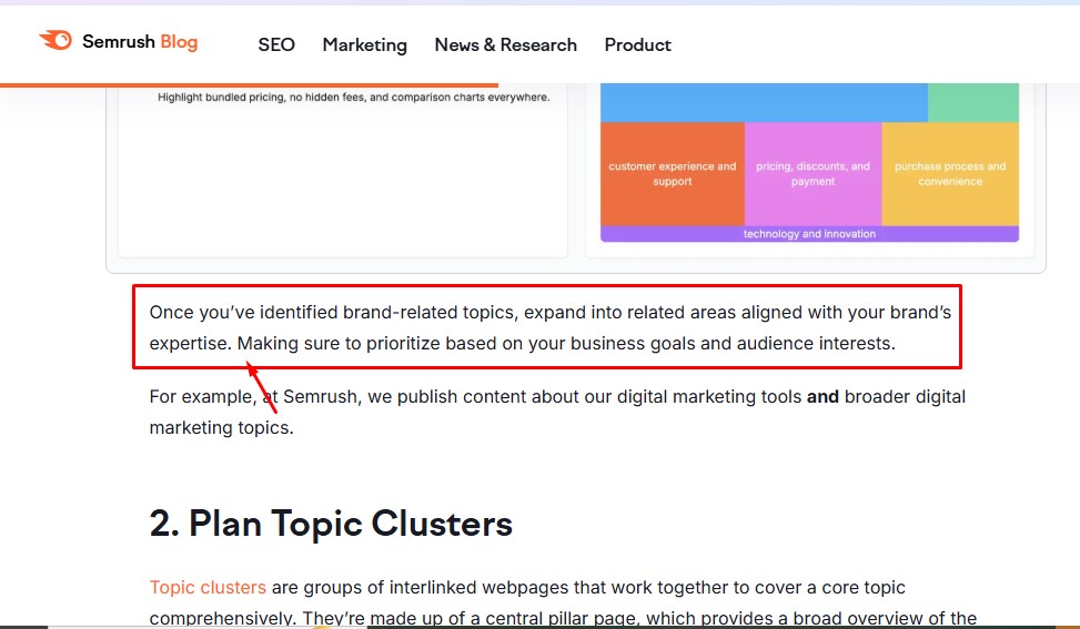
I read Semrush articles a lot. And one thing I’ve noticed is that they use sentence fragments in much of their content.
Here is an example:
Here are common writing rules and why you should break them to improve clarity.
| Grammar Rule | Before | After | Why break the rule? |
|---|---|---|---|
| Never start a sentence with “And” or “But.” | I played game all night. I was exhausted. | I played game all night. And was exhausted. | To improve flow and make your writing sound human. |
| Don’t use sentence fragments. | He went home early because he was sick. | He went home early. Because he was sick. | Improves clarity, rhythm, and adds emphasis. |
| Paragraphs should contain 3–5 sentences. | We visited the cinema yesterday to watch the new Marvel movie. Two hours into the movie, we heard a loud “bang” outside. Suddenly, the whole place was flooded with gun-wielding men. | Yesterday, we visited the cinema to watch the new Marvel movie. Two hours into the movie, we heard a loud “bang” outside. Suddenly, the whole place was flooded with gun-wielding men in military body armor. |
Improves engagement, scannability, and draws attention to key points. |
| Never use incomplete, informal sentences. | Workers must contact HR to resolve issues. They should provide their ID cards. | Workers must contact HR. Have your ID cards ready. | Mimics how humans talk and is much easier to understand. |
| Never use contractions. | Do not enter the room. It is for staffs only. | Don’t enter the room. It’s for staffs only. | Reduces rigidity and makes your writing easier to understand. |
| Never use slang. | The warehouse job is very profitable. | The warehouse job pays off big time. | It makes your writing relatable, keeping your audience engaged. |
While some grammar rules are worth breaking, most carry meaning and shouldn’t be touched. You should only break grammar rules if doing so helps facilitate scanning and clarity.
4. Use bulleted lists
The eyes love bulleted lists.
Research shows that people examine 70% of bulleted lists they come across. This is because, unlike a wall of text, they’re:
- Skimmable
- Visually appealing
- Easy to comprehend
According to Hoa Loranger, VP of Nielsen Norman Group, “Bulleted lists are one of the most powerful methods for supporting efficient reading on the web. A few tiny dots attract the eye and can make a complex concept understandable. Readers perceive the bullets as shortcuts to succinct, high-priority content.”
Bulleted lists are also easy to process because they usually convey a single idea and have a clear structure. Research in cognitive psychology shows that structured information reduces the mental effort required for comprehension.
So when should you use bulleted lists? Use them when order isn’t relevant. E.g.
- Cow
- Dogs
- Goats
- Chickens
If order matters, use numbers. E.g.
- Open Microsoft Word
- Paste the copied text.
- Save the document using any name of your choice.
You can use a bulleted list to:
- Highlight key takeaways
- Summarize important points
- List steps, benefits, or features
For clarity, stick to one idea per bullet. You should also keep them in parallel structure. Here is what I mean:
Instead of:
- Reduces churn
- Makes you convert more customers
- You will retain more customers.
Do this instead:
- Reduces churn
- Improves conversions
- Increases retention
Each item on a bullet should have a consistent style of phrasing or part of speech. Here is an example from HubSpot:
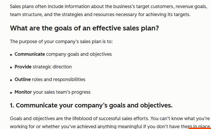
See how each bullet starts with a verb?
To improve scannability, your bulleted list should be short. 3-7 per list is the ideal length. You should also end each bullet the same way, either with a period or without one.
Additionally, place important information at the top of the bullet. Why? Because readers scan. And when they do, they often prioritize the first few words of each bullet.
You should also consider spacing.
I’ve seen a few articles fumble this by cluttering lists, making them unattractive like a messy wardrobe. 1.25-line spacing between bullet points helps visually separate them so they look easy on the eyes.
5. Optimize line length, font size, and line height
Have you ever read an article where reading felt weird even if the content was good? Or one that stretched across your screen and strained your eyes? I have. And it wasn’t a good experience due to formatting issues, like poor line length.
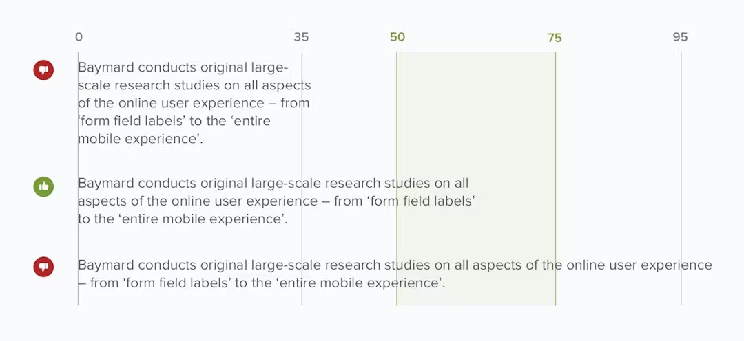
Line length (the width of a block of text) can influence the flow and clarity of your content. An overly long line of text can cause eye fatigue due to excessive horizontal eye movements. It can also hinder comprehension and affect SEO performance in the long run.
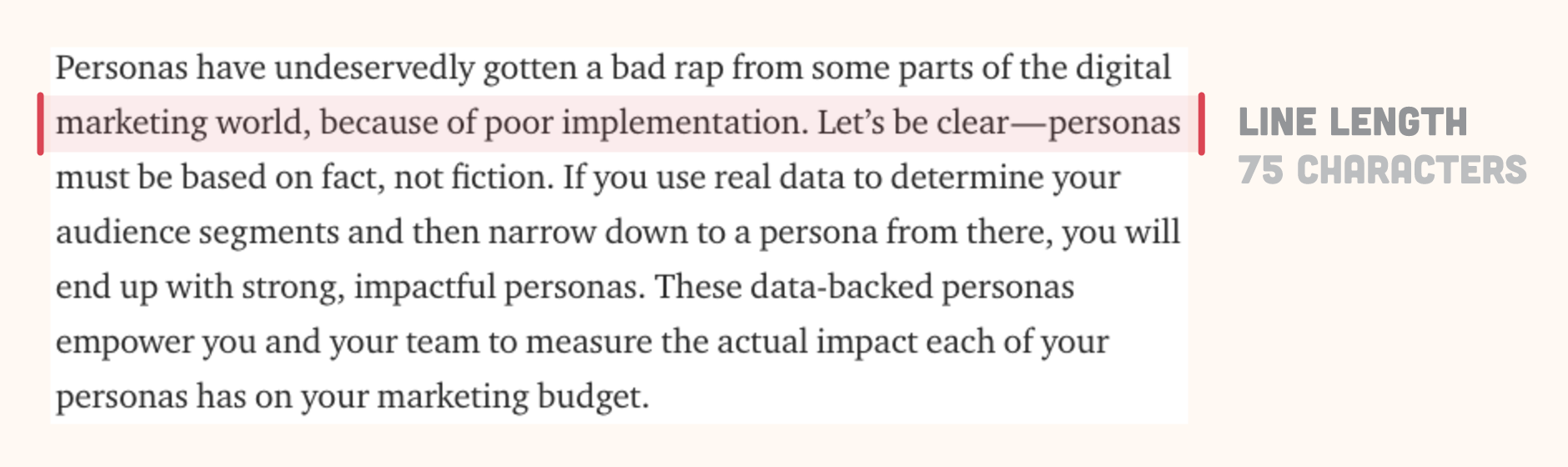
On the other hand, a line of text that’s too narrow can disrupt flow and reading rhythm as readers’ eyes have to travel back too often.
This is consistent with what James Craig, author of Designing With Type, wrote in his book; “Reading a long line of text causes fatigue: the reader must move his head at the end of each line and search for the beginning of the next line.… Too short a line breaks up words or phrases that are generally read as a unit.”
So what’s the optimal line length for readability?
According to classic typography research, 50-75 characters per line is the sweet spot. UX studies confirm people find text in this range easiest to read and comprehend.
Line height (vertical space between lines of text) is another page element you should pay attention to. It determines how cluttered or spacious a paragraph feels.
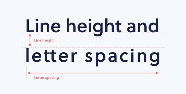
I’ve come across good articles with tight line height. And sometimes I wonder if the writer didn’t notice how chaotic the paragraph looks. Or maybe they did. They didn’t just care.
Listen.
A line height that’s too tight can make your paragraphs appear like a wall of text, overwhelming readers. It can also cause them to reread the same line unintentionally (trust me, no one enjoys doing that). Conversely, if your line height is too loose, each line of text becomes disjointed, causing confusion.
So what’s the sweet spot?
There is no perfect line height. However, a good rule of thumb is to set it at around 150% of the font size. This usually corresponds to 1.5-line spacing in most content management systems (CMS).
After optimizing your line length and height, the next area to focus on is your font size. Font size affects the legibility, reading speed, and ability of readers to comprehend your content.
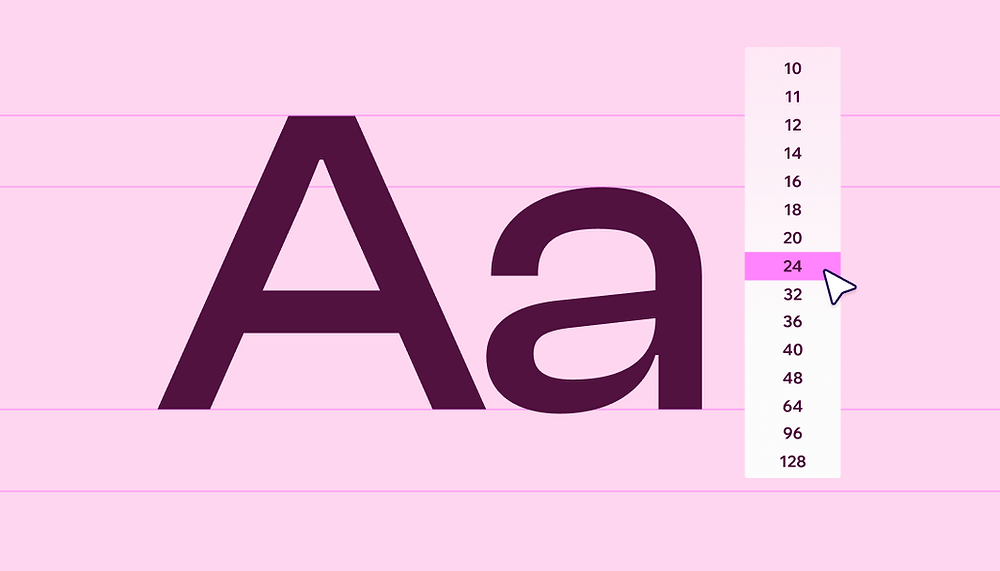
Smaller fonts make text difficult to see, resulting in eye strain and fatigue. Larger fonts? They disrupt the reading flow, causing readers to scroll excessively.
Generally, poor font sizes force the brain to expend more mental energy trying to decipher the text before understanding it. That’s a lot for a brain that doesn’t like unnecessary stress.
According to a 2025 study, readable fonts help comprehension and increase trustworthiness. Another study also discovered that easier-to-read fonts improved visitors’ trust scores by 40%.
So what font size creates a smooth reading experience? It depends. For regular body text, a font size of 16-18px is ideal. At the same time, 18-24px is perfect for larger screens.
For font choice, Jonathan Santini, a Lead Front-End Engineer & Partner at SwiftKick Web, has this to say: “Stick to clear, legible fonts. Sans-serif fonts like Arial, Helvetica, and Verdana are typically easier to read on screens.”
Here is a font size hierarchy table to consider when writing articles;
| Element | Recommended Font Size (px) | Style (Weight/Contrast) |
|---|---|---|
| Main Heading (H1) | 32–48 | Bold, High Contrast |
| Subheading (H2, H3) | 24–32 | Semi-bold, Distinct |
| Body Text | 16–18 | Regular, Strong Contrast |
6. Sentence Length Variation for Rhythm
“Use many short sentences” is a readability hack that sounds good on paper. But flops in reality. There should be a balance.
Yes, short sentences (8-12 words) help make your content clear and readable. However, excessive usage can make your content sound choppy, rigid, and boring.
Do this instead: Introduce some medium (12-20 words) and long sentences (20-25 words) in between. Use short sentences to emphasize important points or create urgency. Then, use longer ones to connect ideas or provide detailed explanations. This helps improve flow and rhythm, making your text sound melodious.
That’s not all.
Varying sentence length also mimics the way humans talk, making your content more relatable and engaging.
Here is a common example from Gary Provost, author of 100 Ways to Improve Your Writing, who likened writing to creating music.
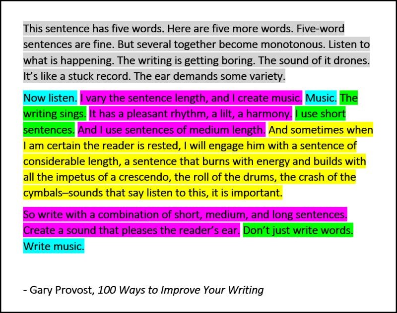
Notice how the first paragraph sounds bland and monotonous while the others sound like melodious music?
7. Don’t rely heavily on editing tools
Want to make your content sound mechanical, robotic, and formulaic? Rely heavily on editing tools.
Editing tools like Grammarly are experts in detecting grammar mistakes. They rely on predefined grammar rules and algorithms to flag errors, suggest corrections, and score readability.
What are they bad at? Understanding context and audience intent, ensuring your content connects with readers emotionally, varying sentence length to improve flow and rhythm. And tailoring your content to match your voice and personality.
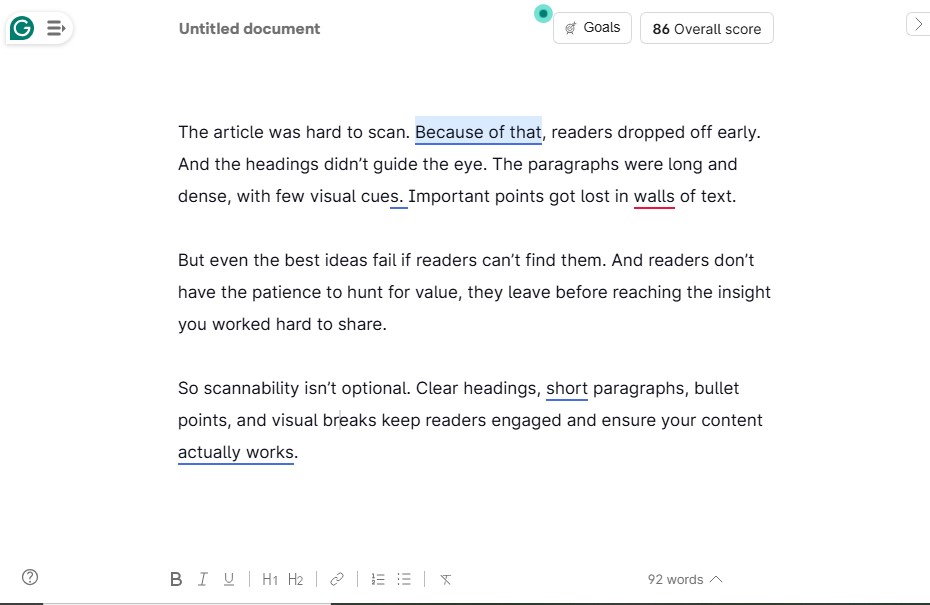
For instance, Grammarly might flag a sentence you start with a conjunction, even if it improves the flow and rhythm. It might also flag passive voice, even if it’s the best way to present what you intend to say.
Milovan Filipovic, a user, described his experience in his review: “Grammarly flags perfectly fine sentences and suggests awkward rephrasings. The tool can diminish the quality of your writing if you accept all suggestions.
“It will sap the life out of your writing. The tool flags random words for ‘clarity’ and replaces them with awkward suggestions or synonyms, making your writing artificial and robotic. It also has a personal vendetta against creative writing.”
It’s not all smooth sailing with Grammarly.
Brittany Barney, another user, points out: “…It catches basic spelling and grammar mistakes, but a lot of the suggestions don’t fit the tone or flow of what I’m actually trying to say. Sometimes it even changes things that were already correct, which gets frustrating fast.”
Grammarly isn’t the only culprit here. Hemingway App, editor’s favorite, is another tool you shouldn’t rely excessively on.
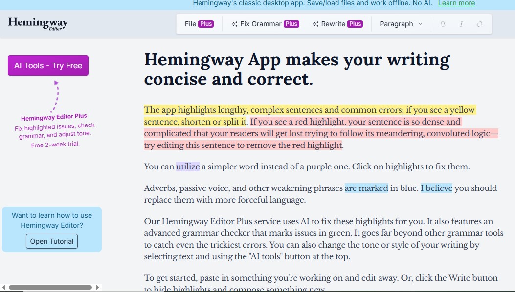
It oversimplifies your writing by turning complex ideas into very simple sentences, removing nuances like tone, intent, and voice. Plus, following its suggestions strictly might cause your content to become bland and flat.
Moreover, the Hemingway app doesn’t consider style, tone, and intent, hence may incorrectly flag sentences even if they fit the context and communicate your message effectively.
Don’t get me wrong, Grammarly and Hemingway are great editing tools. I use them a lot, but not blindly. For example, I don’t accept all the suggestions. Instead, I check if they preserve the tone, style, and meaning of the message I want to pass across.
I also do these:
- Read the text aloud to catch hidden errors.
- Prioritize sentence rhythm
- Mix sentence length
- Self-edit thoroughly after using editing tools
Does Readability Affect SEO?
Readability doesn’t affect SEO directly. Google’s Senior Webmaster Trends Analyst John Mueller confirmed this:
“From an SEO point of view, it’s probably not something that you need to focus on, in the sense that, as far as I know, we don’t have kind of these basic algorithms that just count words and try to figure out what the reading level is based on these existing algorithms. But it is something that you should figure out for your audience.”
So should you ignore readability? Absolutely not. When your content is clear, easy to read and understand, people will happily spend more time on the page. The result? A positive page experience.
And as you probably know, Google heavily prioritizes page experience, as confirmed by an official statement:
“Google’s core ranking systems look to reward content that provides a good page experience. Site owners seeking to be successful with our systems should not focus on only one or two aspects of page experience. Instead, check if you’re providing an overall great page experience across many aspects.”
Moreover, when a reader spends more time on your webpage, it signals to Google that your content is quality and helpful. It also reduces bounce rate.
The focus here shouldn’t be on readability alone. You should also tailor your writing so that it suits your target audience.
SEO Gets Them In. Readability Makes Them Stay.
Your SEO effort goes to waste if visitors struggle to understand your message. This is why you should invest similar effort in optimizing your content for readability.
Front-load important information. Include one idea per paragraph. Use bulleted lists. Optimize line length, font size, and line height. And when necessary, break grammar rules to improve clarity.
Doing all these improves comprehension and encourages readers to stay longer. This leads to better conversions, lower bounce rate, and improved SEO performance.
Try applying these readability tips in your next article and watch your engagement increase.